Color Inspiration Series Post 3
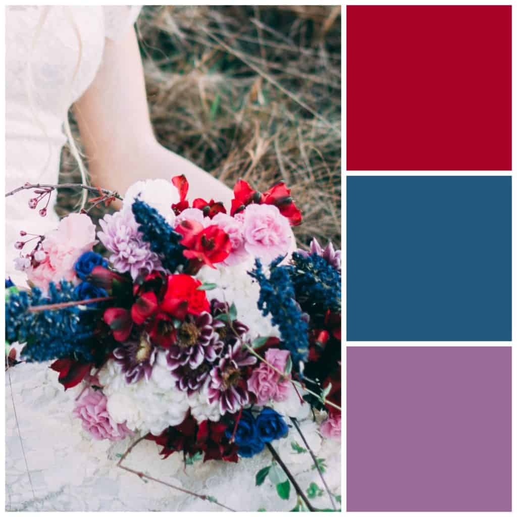
This week I thought I’d demonstrate how three analogous colors can be used in very different ways to achieve beautiful results. Let’s talk more about analogous colors and look at the cards a little bit closer. I must admit that the examples are more backgrounds for cards and don’t have sentiments on them. I thought about it and wanted to influence you as little as possible in your card design but still provide a sample of the colors used in some manner. This was my solution.
Affiliate Disclosure Policy
This post contains affiliate links for your convenience. This means if you make a purchase after clicking a link, I will get a small commission with no additional cost to you as the consumer. Jill Cameron Creations/Jill Lipscomb participates in the Amazon Services LLC Associates Program, an affiliate advertising program designed to provide a means for sites to earn advertising fees by advertising and linking to Amazon.com. For full disclosure policy click here.
Analogous Colors
Analogous colors are colors that appear next to each other (to the right or left) on the color wheel. The colors usually go very well together and very pleasing to the eye. Pick any three colors next to each other and they should go together. Try it out and see for yourself. Click here for the color wheel we used before to play in post 1.
Cards
One this you will notice about these cards is there are no sentiments. Sometimes when you see an image used on a card, let’s say for a birthday card, you can’t see that image on another type of card. I’ll finish these off with sentiments and send them out at a later time. You can do that too! Make a bunch of beautiful cards and leave the sentiment off until you decide on an occasion.
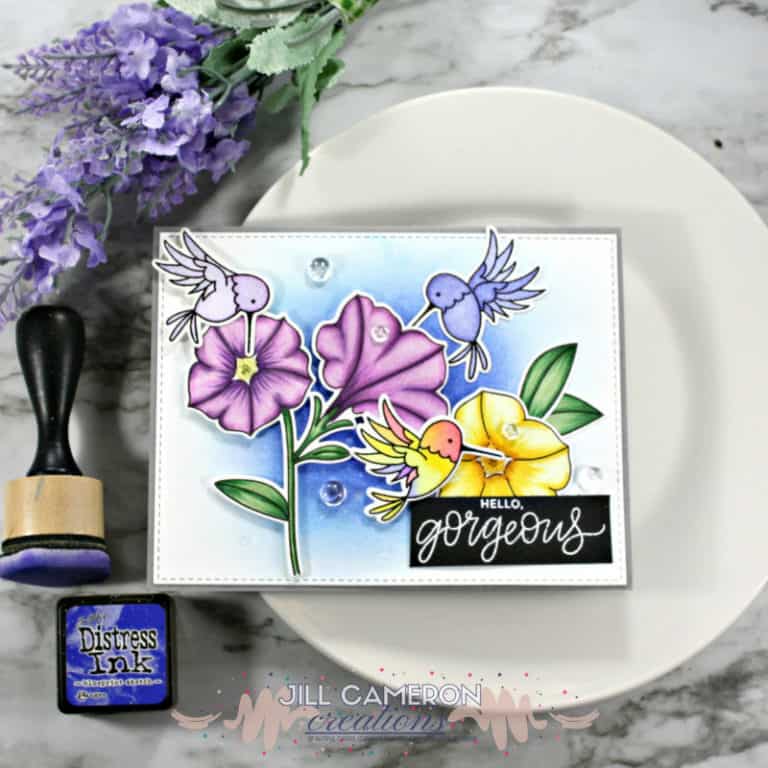
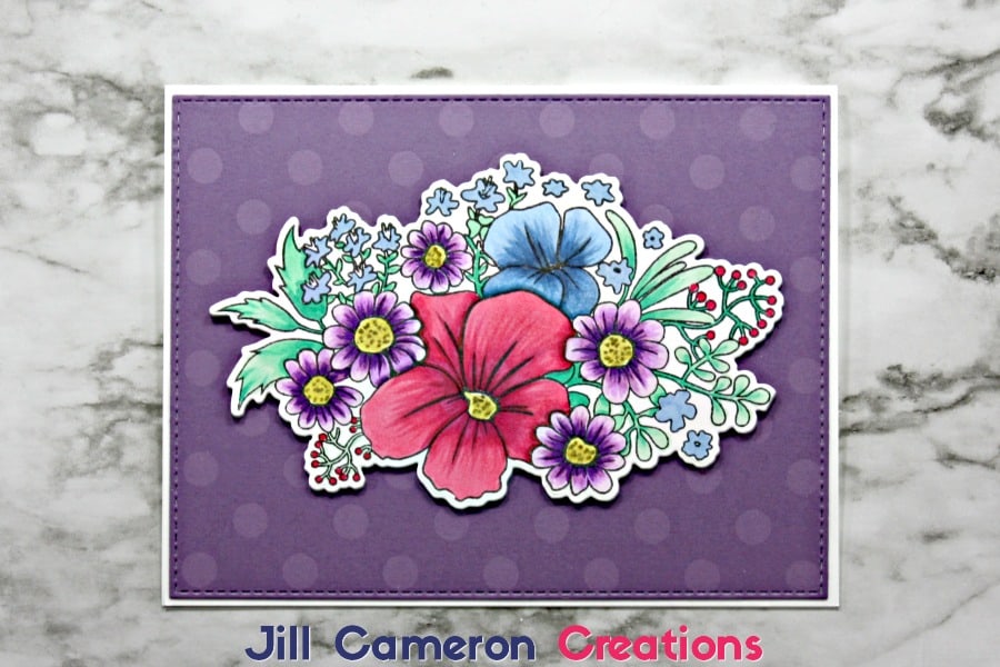
The first card, I used Copic markers to color the stamped image. I added a cool green and a warm yellow to complete the image. You don’t have to stick to just the colors in the sample as I’m demonstrating here. Look at how these colors work together on this image. Also, I picked the darker purple to make that image really pop.
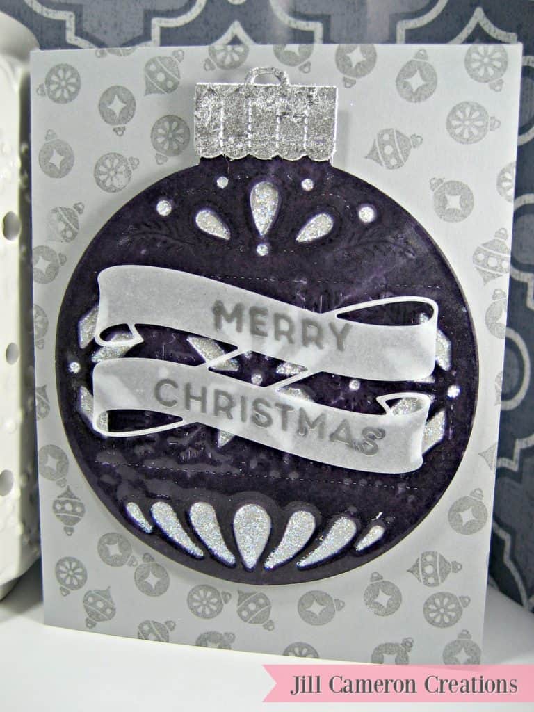
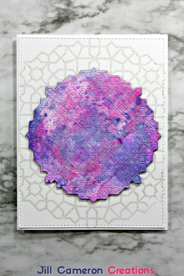
The second card I wanted a more subtle look. I did ink smooshing with Distress Oxide inks on glossy cardstock. I coated the final product with Distress Micro Glaze. Notice how well the colors blend together and do not create a muddy look. That’s what analogous colors will do for ya there! 🙂 Check out my blog post on Ink Smooshing with Distress Oxide Ink on Glossy Paper.
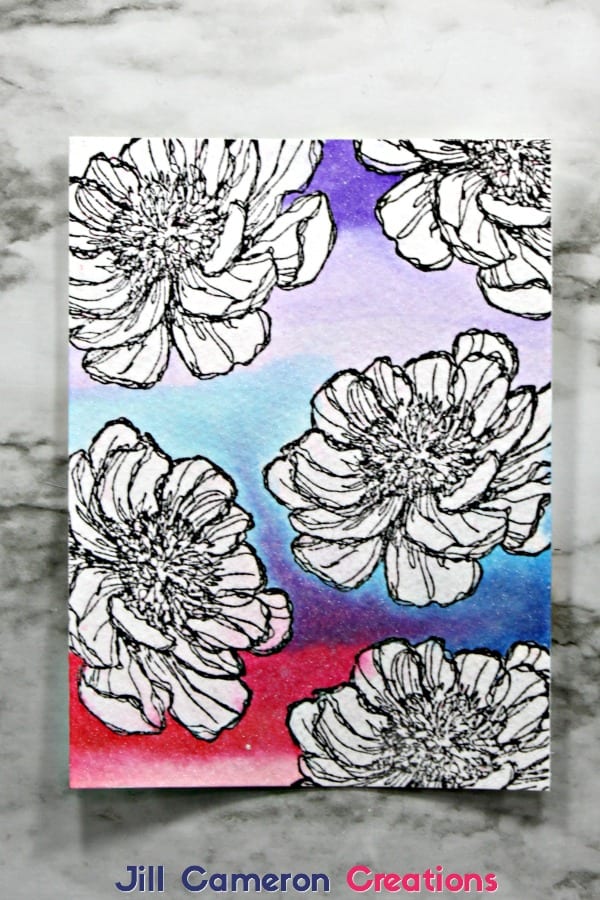
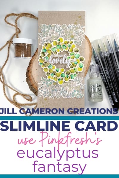
The third card isn’t really a finished card but it’s a background panel for a card. I stamped the floral image on watercolor paper using Versafine Black Onyx ink. Instead of coloring the flowers I colored the background using Tombow markers and then spritzing with water. The colors blended and ta-da, a brilliant background. Where the blue and red blended together is my favorite part. Just add a sentiment to this card and it’s all done.
