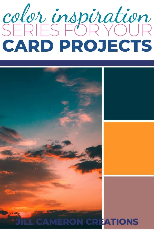
This week we are going to look at a navy, an orange, and a pinkish brown color as our color inspiration. I would never think to pick these colors together for a card but they are SUPER pretty!!! It’s always a good idea to step outside of your comfort zone when it comes to color. It keeps your cards looking fresh and ideas flowing.
This week we’re also talking about color hue and saturation. I’m defining these terms for you below and detailing how this information can help you when you are picking the color pallet for your card. These colors for this week’s color inspiration might not be your cup of tea but maybe a slight adjustment in hue or saturation might be just the thing to make them sing!

Need some help getting the juices flowing for this one? Check back to your Post 1 for some questions that will you have you thinking outside of the box for color inspiration!
This week’s color inspiration made me think of beach sunsets where the sun is setting low off the ocean but there’s still that really beautiful deep orange glow. The sand gets a darker and warm color while the water and sky turn a deep blue. Ah! My happy place!
This week’s color inspiration might make you think of a warm fall evening or inspire thoughts of your favorite dress.
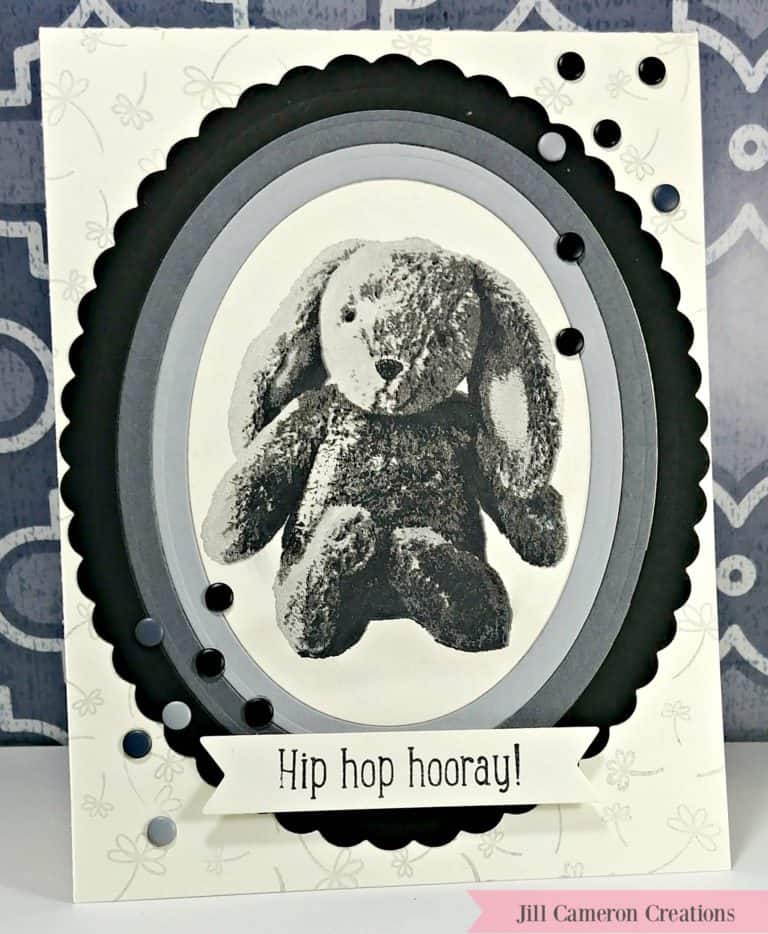
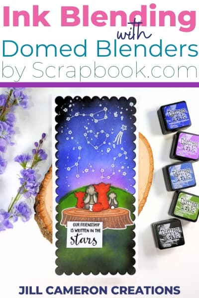
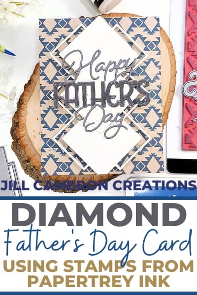
Cards I created using the week two color inspiration
Here are the examples of how I used the color inspiration is VERY different ways!

This post contains affiliate links for your convenience. This means if you make a purchase after clicking a link, I will get a small commission with no additional cost to you as the consumer. I participate in the Amazon Services LLC Associates Program, an affiliate advertising program designed to provide a means for sites to earn advertising fees by advertising and linking to Amazon.com. For full disclosure policy click here.
Tips for Using Dark Colors in Your Cards
- I love deep colors because of the richness of them. The problem I run into is I’m never really sure what to do with them. Is the color “too” much? I’ve come to realize there is no such thing as “too” much when it comes to color! Color is a beautiful thing!
- Use various hues and saturation of the color. (More on hue and saturation below.)
- Be inspired by what you instantly picture when you see the colors.
What is Hue and Saturation in Color?
The words we use to describe different colors is known as a hue. ‘Hue’ means the name of a color such as green, orange, yellow, or navy. It’s how we verbally describe colors.
Saturation is the intensity of a color or how much grey is added to the pure color. Saturation is how vivid a color appears. Below is our pinky-brown hue. The top right of the square is the pure color. As you move to the bottom left corner, the color becomes greyer or less saturated. The circle indicates where our color is in this example.

Don’t forget if you need help with picking a color to use that color wheel!