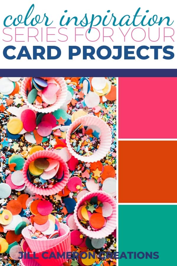
Color Inspiration Series Post 1
I’ve been wanting to do some kind of inspirational series for a while now and I thought color would be the best place to start. So this is post number one of my Color Inspiration Series. I want you to take the information and colors in these posts and create something beautiful. Without further ado here’s your first post of color inspiration…

Now, what on earth are you supposed to do with that? Whatever you want to do! That’s the great part of this. Here are some questions to get you thinking about how you can use color to inspire a card creation:
- What emotion do these colors bring evoke?
- What images to you see in your mind associated with these colors?
- Do you see another color that goes with these colors?
- Do you have a friend that would LOVE these colors?
- Do you have a specific stamp set you can see with these colors?
This week’s color inspiration made me think happy, shiny thoughts. There is just something about bright pops of color against black or gray that just tickles my senses. Below are a couple of tips for color in your cards and most all of the products used in these cards. Remember, this is all about inspiration!
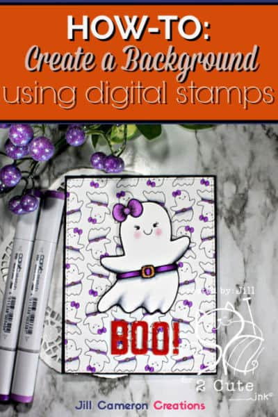
Cards I created using the week one colors

Affiliate Disclosure Policy
This post contains affiliate links for your convenience. This means if you make a purchase after clicking a link, I will get a small commission with no additional cost to you as the consumer. Jill Cameron Creations/Jill Lipscomb participates in the Amazon Services LLC Associates Program, an affiliate advertising program designed to provide a means for sites to earn advertising fees by advertising and linking to Amazon.com. For full disclosure policy click here.
Tips for Creating with Bright Colors
- If you are using big, bold colors try pairing them with black or gray like I did here. It really makes those colors stand out.
- If you really like the colors but they are just a little TOO bold, use a stamp off technique to get a softer look.
- “But I’m not sure I really like these colors. Especially on a card.” Not your cup of tea, huh? Then change it up! Use a color wheel to help you pick a color.
Things to NOTICE in my cards
- Notice I used various shades of each color on the “Shine on with your bad self” card.
- The card with “Shine Bright” on it, has very little of the color but look how those colors pop off the card.
- For the “Happy Thoughts” card I paired the three inspiration colors with a neutral which makes these colors POP even more!
- Neutrals can be grey, kraft, black, white, and even a super lite blue. And remember there are various shades and colors of neutrals too. Some greys are more brown or green than others. Trust your eyes when you pick your colors.
Need help picking a color?
So…you like two of the colors in this week’s inspiration but you’re not thrilled with the pink. How do you find a color that coordinates and doesn’t clash? Use a color wheel! Now, this might be a bit more information than you want about a color wheel but I like to share information and what I learn with you guys! You never know when this information will come in handy…like trivia night at the local pizza joint?! 🙂
About the Color Wheel
Color wheels are a great resource to use to help pick colors for your card. I use one all the time! “The color wheel is a chart representing the relationships between colors. Based on a circle showing the colors of the spectrum originally fashioned by Sir Isaac Newton in 1666, the color wheel he created serves many purposes today. Painters use it to identify colors to mix and designers use it to choose colors that go well together. The classic color wheel shows hues arranged in a circle, connected by lines or shapes. The colors include primary colors (red, yellow, and blue), secondary colors (orange, green, and violet), and tertiary colors (yellow-green, blue-green, blue violet, red violet, red-orange, and yellow-orange). Secondary colors are created by mixing primary colors. For example, mixing red and yellow creates orange; mixing yellow and blue creates green.” (Color Calculator, Sessions College)
Rainbow order is referred to most of the time as ROYGBIV (red, orange, yellow, green, blue, indigo, violet).
On a computer, colors are represented by a specific combination of letters and numbers (aka color code). Here are the colors used in this weeks color selection: f93a6d, db4208, 02a48c. Check out the Color Wheel and Color Calculator on the Session College website (it’s totally free). Just plug in one of the color codes in and see what the color wheel comes up with. There are explanations of several color terms like complimentary colors or analogous colors.


One Comment
Comments are closed.