Inspired by Other Card Makers
Hey y’all! One day last week I sat down and watched a few videos from other card makers. I hadn’t done this in a long while just because I’d been doing my own thing. I saw a video by Justine Hovey that was talking about being inspired by other card makers and how to recreate them in your own style.
We’re going to go over a few things about being inspired by other card makers. First we’ll talk about CASEing a card. And then we’ll go over some tips to make that card your own. Lastly, we’ll go over quickly how I created this amazing slimline Christmas card in navy and gold.
All products used in this card are listed at the bottom of this post.
Inspired by other card makers?
There’s a term that gets thrown around in card making (and scrapbooking): CASE. It means “create and share everything”. I’m not 100% sure where the term originated but it’s been around for a long time. The premise of this concept is simple. If I create a handmade card and share it, you then copy that card, it’s a CASED card. It basically means the design isn’t yours but was inspired by someone else.
Just like most things in this world now a days, some folks get real upset about copying a card design and others don’t really care. Here’s a good rule of thumb about this concept:
- If you are inspired to create a card by a card maker and you’re going to share that card on social media then share who inspired you. You don’t need to tag them or anything like that, just simply say “I was inspired by ____”.
- There’s no need to put on the physical card anywhere that you were inspired by anyone.
- If you were inspired by a color scheme but the cards look nothing alike there’s no need to include an inspired by clause unless you want to.
- If you were inspired by a specific technique, such as one of those amazing cards that Jennifer McGuire does that’s interactive that doesn’t use any dies, but the card uses different everything else, then there’s no need to say it was inspired by unless you want to.
You get the picture here. Not everything needs to be noted but a direct duplication of a card needs to be noted.
Tips to make the card your own
You saw that amazing card and you really want to make it. No matter what you do that card will never ever be exactly like the one you saw. It has nothing to do with talent or products either. It’s the person making the card. No two set of hands will create the same thing the exact same way when it comes to art. You can try but there will be differences. You know what? That’s the amazing thing about creating these 4 1/4″ x 5 1/2″ pieces of art! Each of them are unique and beautiful. So embrace it!
- You love the layout of the elements on the card, but not the colors. So change them!
- You love the colors but not the specific flowers stamps. So change them!
- Oh man that bold sentiment is amazing but you need a birthday card and not a congrats card. So change it!
- If you have a Silhouette Cameo or a Cricut use that to create unique sentiments coupled with the same stamps used on the card you’re inspired by.
- Instead of gold embossing, try gold foil or the other way around.
This list can go on and on. The biggest tip I can give you here is use the part you love the most and then add your own personality to it. Use the glitter! Use the jewels! Make it all about your style.
Slimline Christmas Card
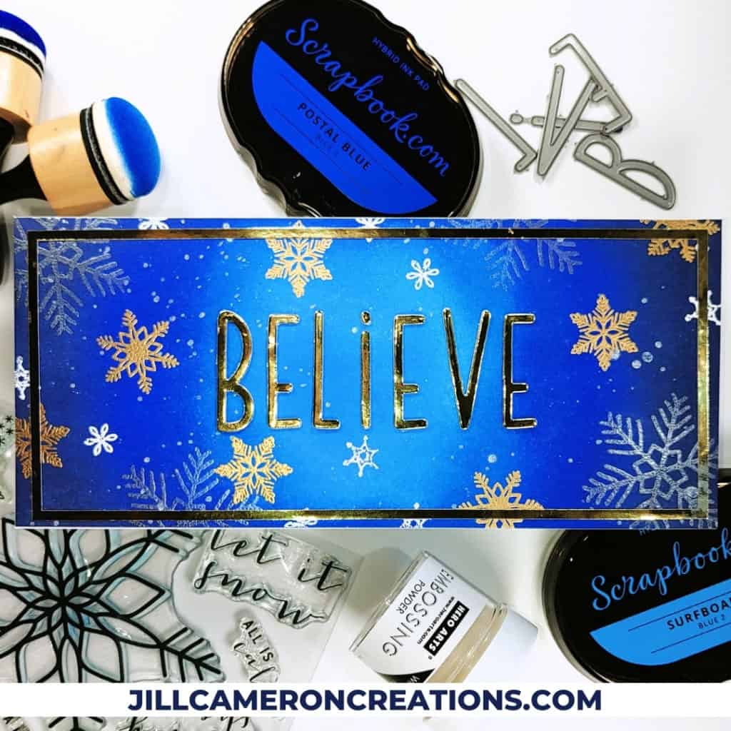
I created a slimline card that measures 3 3/4″ x 8 1/2″. There are a lot of different sizes for slimline cards. I have the panel and frame SVG linked below for my shop. I have larger slimline panels and frames too.
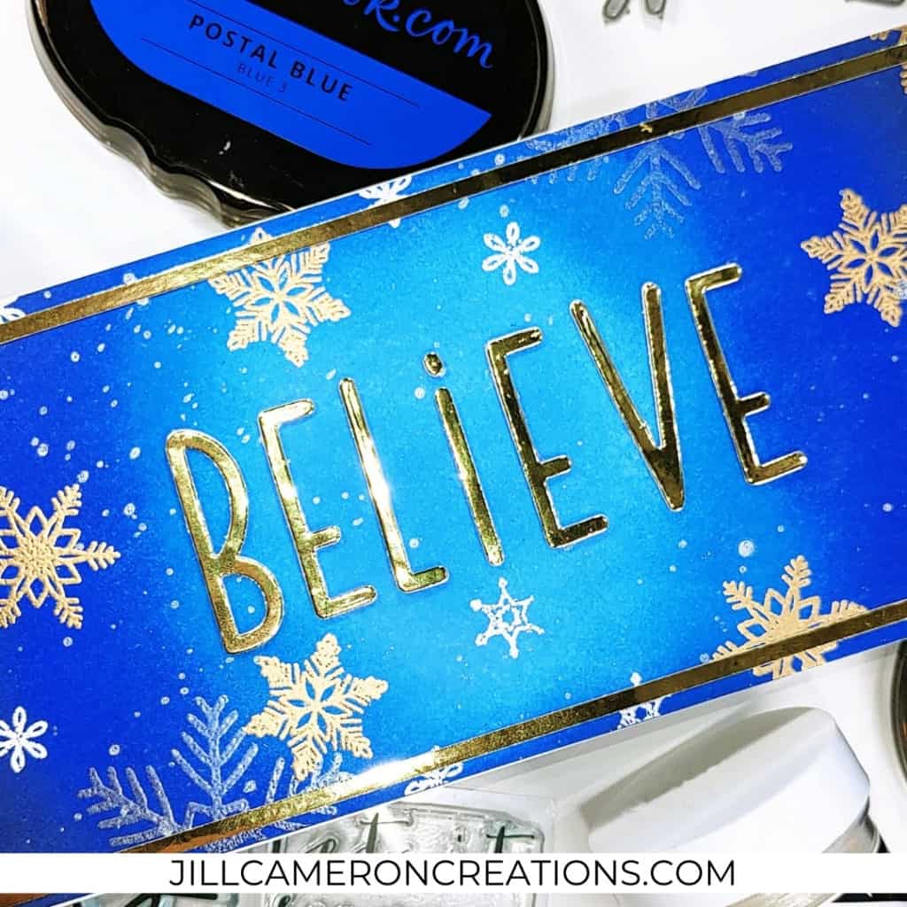
First, I inked blended the panel from the center to the outer edge. The cent is the lightest and both ends are the darkest. I used domed ink blending tools from Scrapbook.com and their ink too. I ink blended the colors twice.
This caused a bit of warping with the panel because it was so much ink on the paper. I ran it through my die cutting machine to flatten it out. Be sure to use typing paper on either side so it doesn’t get marks from the plates.
Next, I splattered it with pigment powder. While the panel was drying I die cut a bunch of letters to spell “believe” from white cardstock and gold cardstock. I layered the cardstock to give the letters depth. I aligned the letters in the center of the panel and glued each letter to the panel.
Then, I stamped snowflakes all over the place. I used gold, white, and Satin Pearl embossing powders.
The card looked a little plain to me at this point so I die cut a slimline frame using my Silhouette out of the same gold card stock I used for the letters. That stepped-up this card so much! I love it!
Thank you for joining me today for this slimline Christmas card inspired by other card makers.
Affiliate Disclosure Policy
This post contains affiliate links for your convenience. This means if you make a purchase after clicking a link, I will get a small commission with no additional cost to you as the consumer. Jill Cameron Creations/Jill Lipscomb participates in the Amazon Services LLC Associates Program, an affiliate advertising program designed to provide a means for sites to earn advertising fees by advertising and linking to Amazon.com. For full disclosure policy click here.

