Silhouette Cut Settings – Overcut
I
Enter the Silhouette digital die cutting system! (Pretend I said that like a circus announcer. hehe.) I can create any sentiment I want for any project in the size I want and pick just the right font. There are few things to understand about how the software and the machine work so that you can get the best cuts possible.
Honestly, I didn’t use my first Silhouette Cameo often to cut paper. It always tore and never cut all the way through the paper. Plus getting the paper off the mat was a nightmare. That’s no longer the case. Having the correct Silhouette cut settings makes all the difference in the world. The overcut feature being the one cut setting you need to know about. Let’s take a closer look at the overcut feature.
Affiliate Disclosure Policy
This post contains affiliate links for your convenience. This means if you make a purchase after clicking a link, I will get a small commission with no additional cost to you as the consumer. Jill Cameron Creations/Jill Lipscomb participates in the Amazon Services LLC Associates Program, an affiliate advertising program designed to provide a means for sites to earn advertising fees by advertising and linking to Amazon.com. For full disclosure policy click here.
Silhouette Studio Overcut Feature

The Silhouette Studio software has this amazing feature called overcut. First let’s answer two important questions: What is it? And why do you need to use it?
Overcut does exactly what it the same says. This feature tells the Cameo (or other versions of the machine) to overcut the line in the corners. This means the machine cuts the tiniest bit further than the design at the corners. The blade actually lifts up and turns in a different direction and then continues to cut.
If the overcut feature is not turned on in the Send panel then the blade does not pick up and the paper tears in the corners. This is where you run into issues and you grab that Xacto knife. Well, no more Xacto knives my friend! Use the overcut feature next time you’re cutting anything detailed.
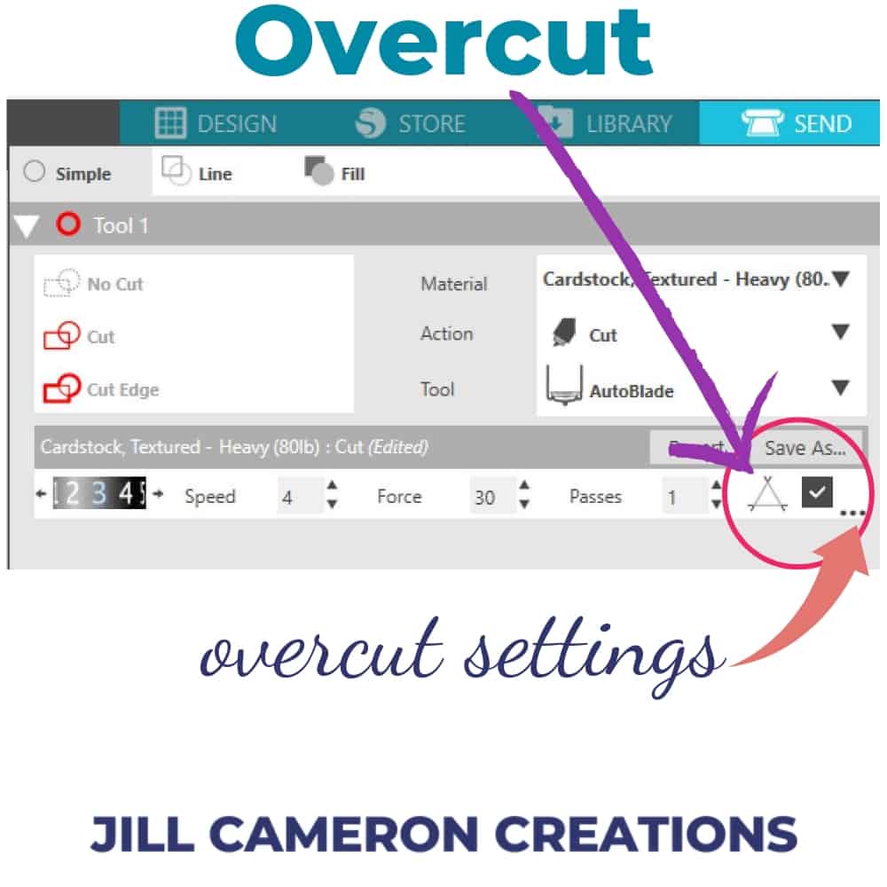
There’s one more setting that’ll help!
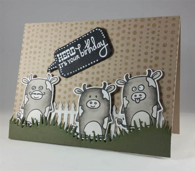
Okay, so that’s not the only setting that makes all the difference in the world when it comes to cutting detailed images. The Passes setting needs to be set to at least 2. Check it out for yourself in the photo below. I picked an especially thin and dainty font to create a sentiment image for the front of this card. I cut the sentiment three times and stacked each letter just like I would if I had die cut in the traditional method. Look how clean those letters are!!! LOVE it!!!!

See more Silhouette Projects
First Cut with Silhouette Cameo 3
Use Silhouette Studio with Digital Stamps
Custom Stencils for Cards

4 Comments
Comments are closed.