AECP Set of Encouragement Cards for the Guys
Hello! Today I have two posts for you. This one is a set of encouragement cards for the guys and the second is a set of encouragement cards for the gals.
This is my final project for Level 1 of the Altenew Educator Certification Program.
There were three classes in Level 1 of the program that I found to be foundational for cardmaking because these techniques can be used in so many different ways. I used techniques from each of these classes on all of the cards created.
- Beyond Basic Backgrounds
- Easy Ink Blending Techniques
- Let it Shine
Watch the video below to see how each card was created. All of the products I used are linked at the bottom of this post.
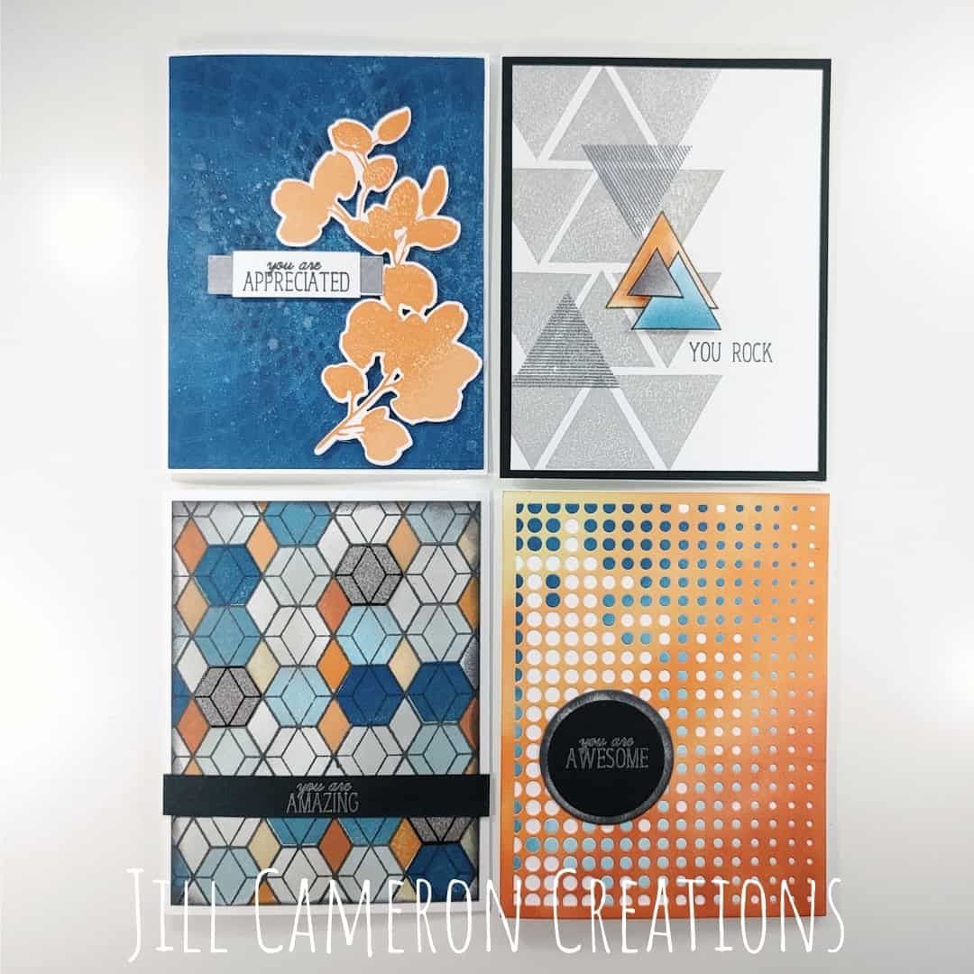
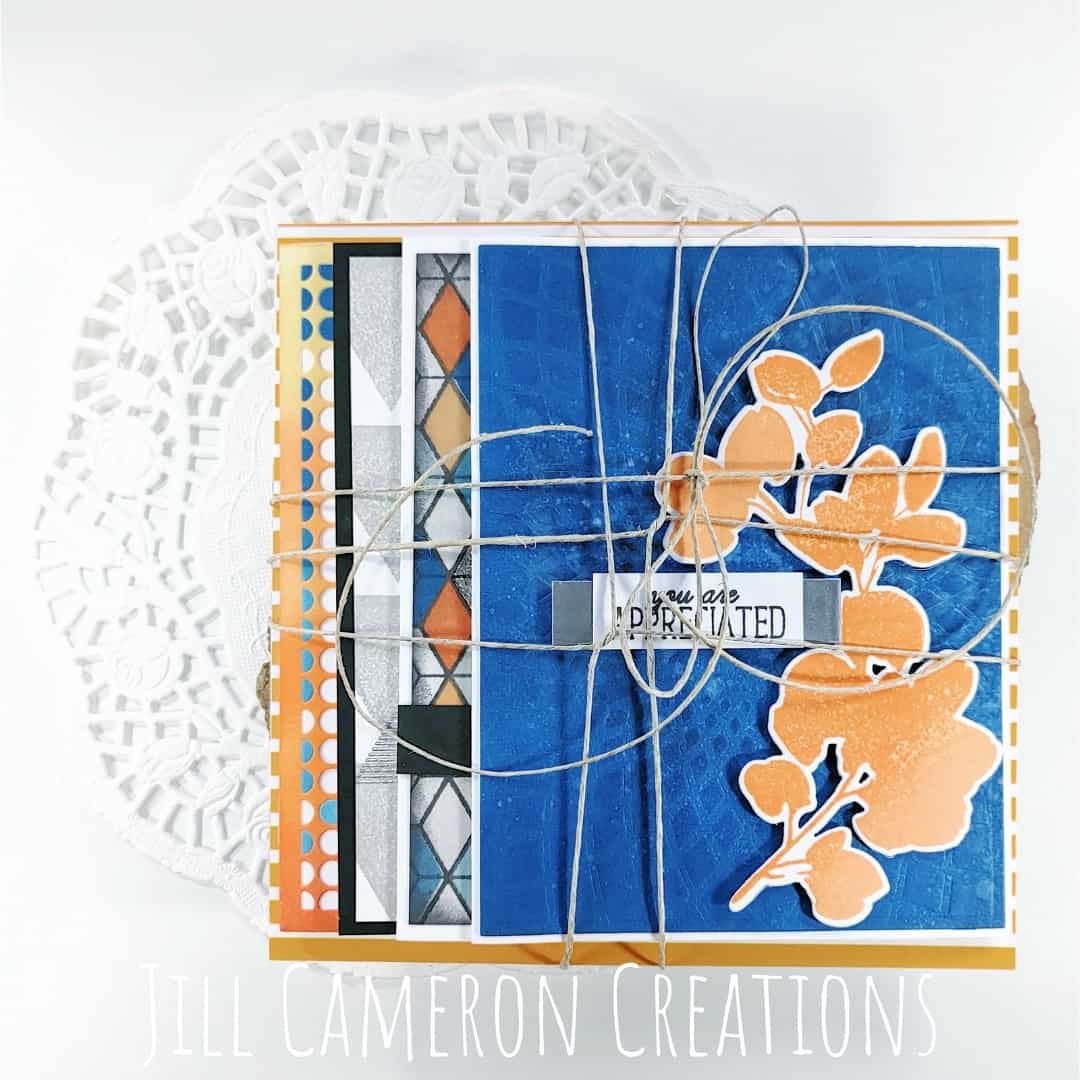
I picked out my colors first before I started my cards. We’re using blues and oranges with dark gray. Blue and orange has become one of my favorite color combinations so this was the perfect opportunity to use it. I also wanted these cards to have a bit of a grungy look to them.
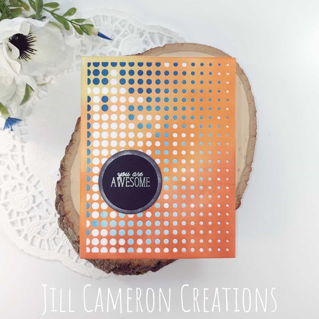
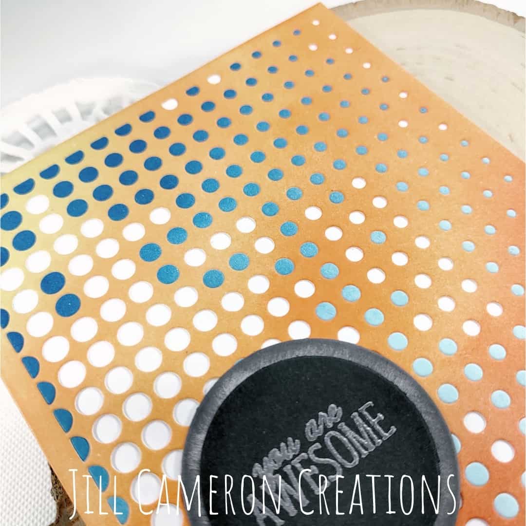
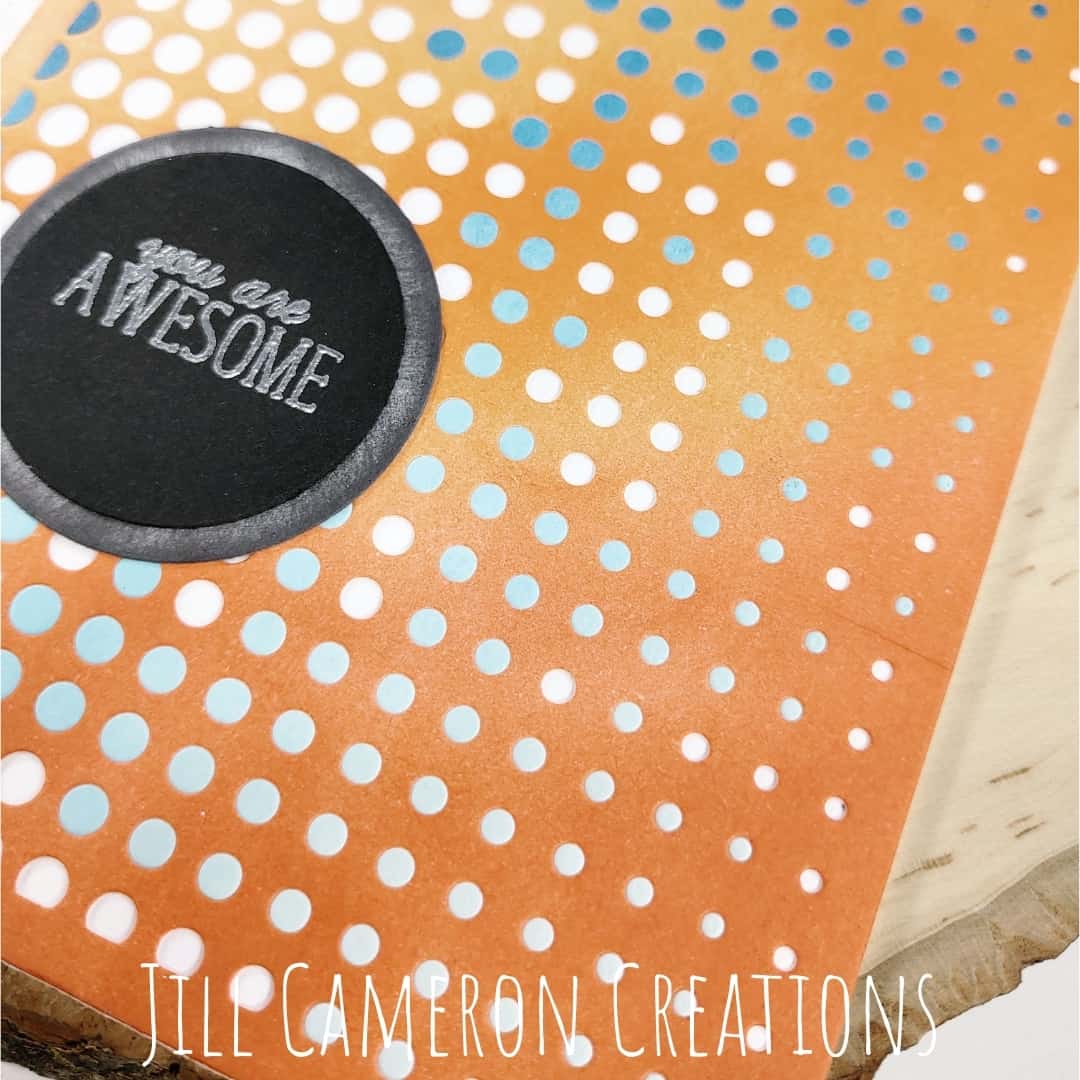
The first card is a geometric heavy card. I stamped the background in dark grey ink and then used the small stamps to randomly fill in the pattern. I left some of the image unstamped.
I also added three areas of embossing in Distress Glaze. This embossing powder is transparent so it adds shine but you can still see the pattern through it.
Then, I trimmed the panel down a little bit and ink blended lightly over the entire surface of the card to knock down the bright white. I ink blended around the edges of the panel to create more depth for the panel.
The sentiment is centers on black cardstock in silver embossing powder.
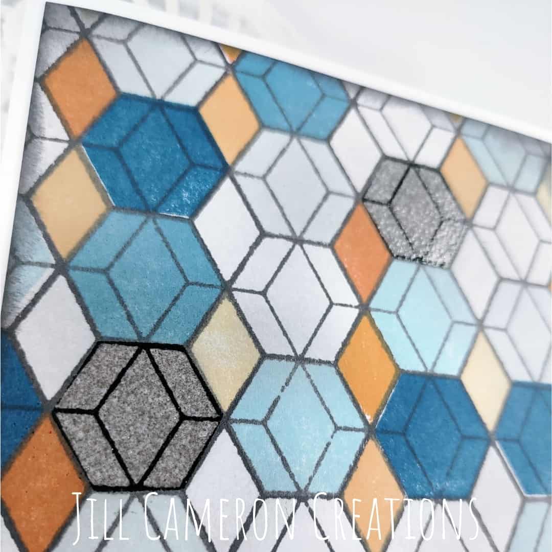
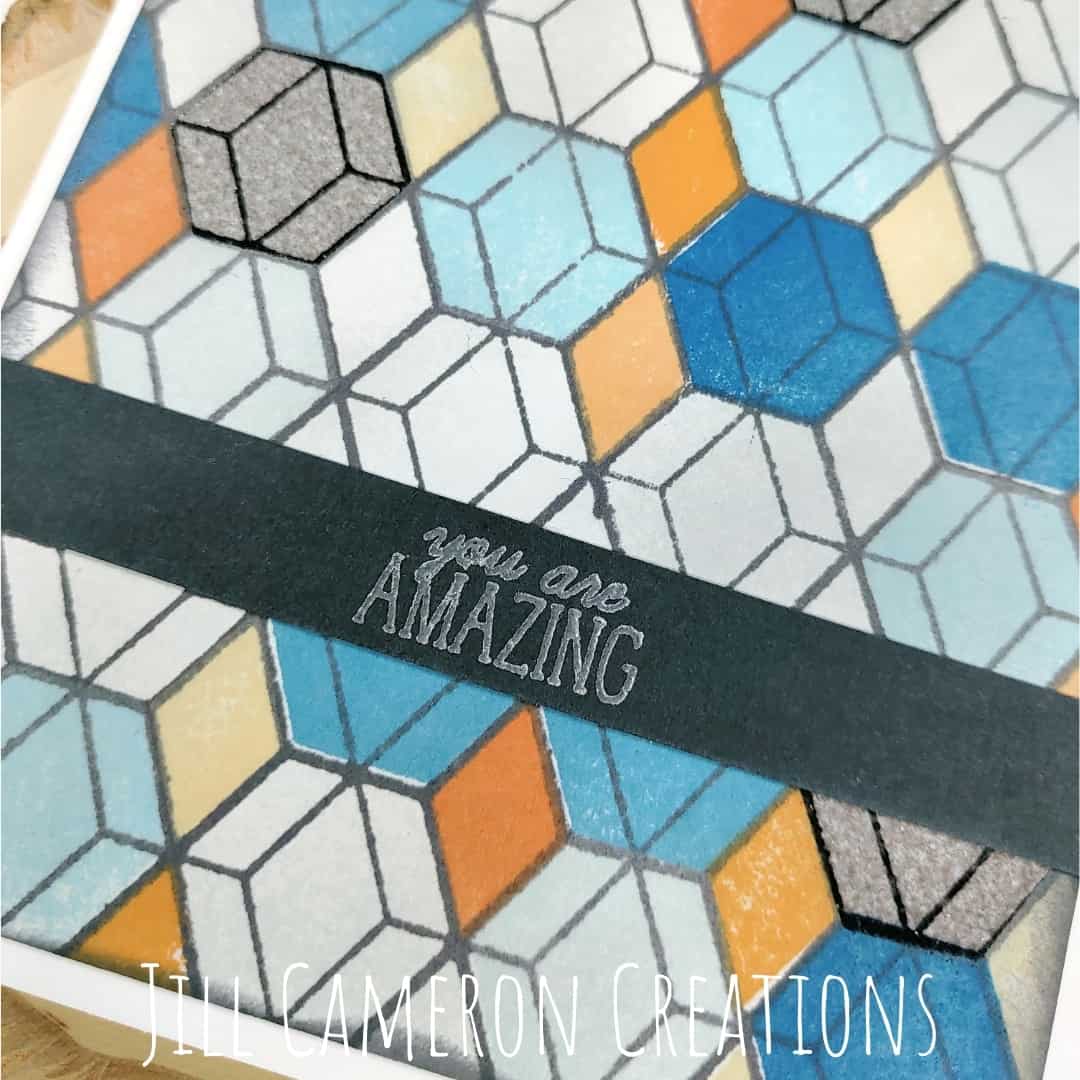
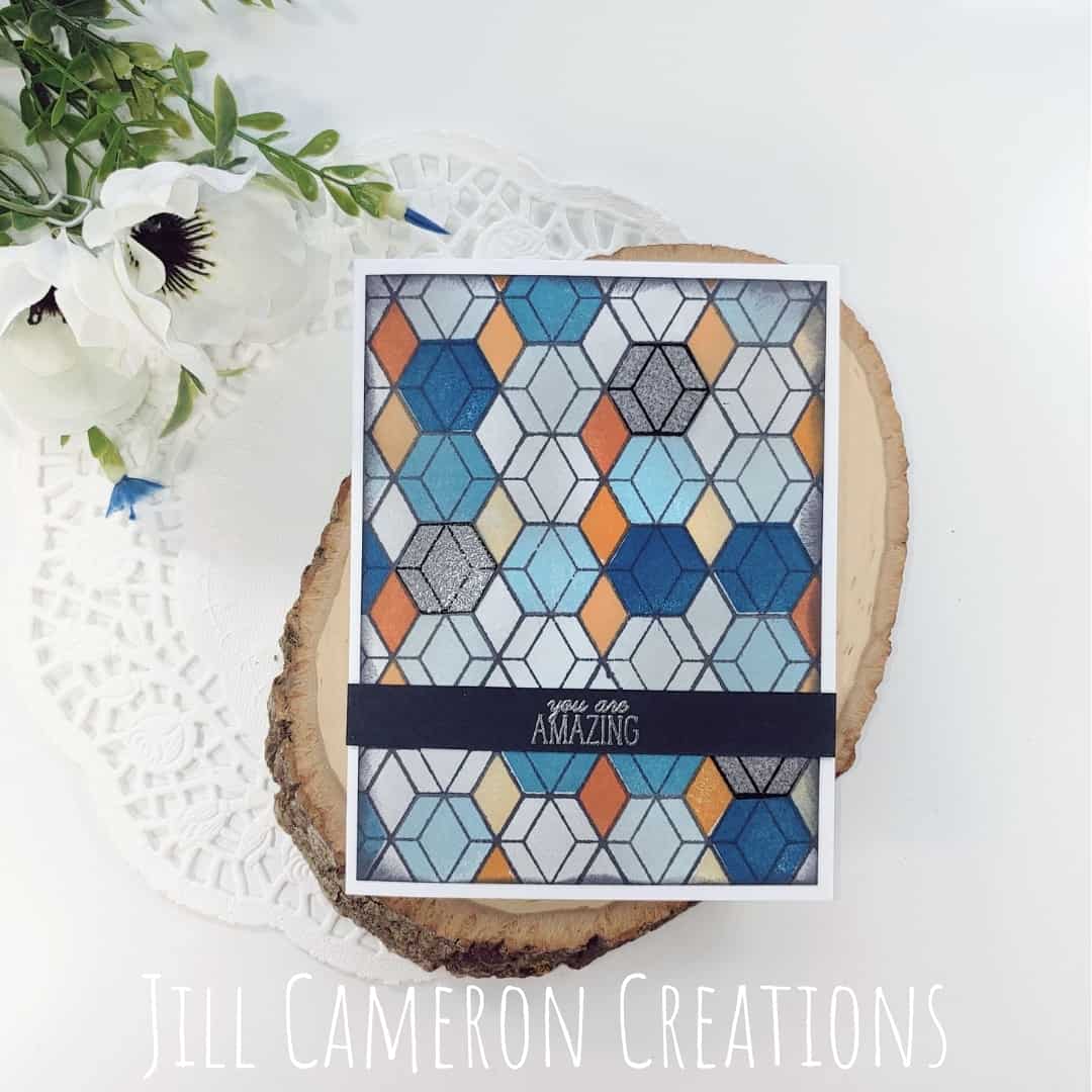
To be real honest, this card didn’t go as planned however I still love this card. And just because a card doesn’t go as planned doesn’t mean it’s a bad card. I like turning “oopsies” into “oh wows”.
To start this card, I added double sided adhesive sheets to the back of white cardstock panels. Then I ink blended both panels. One in orange and one in blue.
I die cut both panels using the Halftone Cover Die. Then I very carefully pulled the die cut away from all the dots. Then I place the orange die cut over the blue dots.
Next, I pulled away the backing paper and adhered it another white panel. Not all of the blue dots came along for the transfer. And that’s okay. I could have popped them over but I liked the unfinished look of it.
Instead of a sentiment strip, I did a circle to go along with the background.

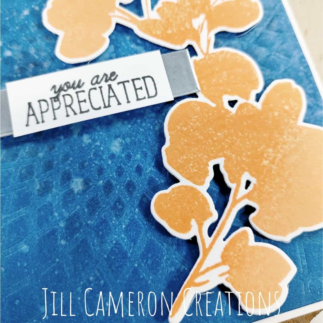
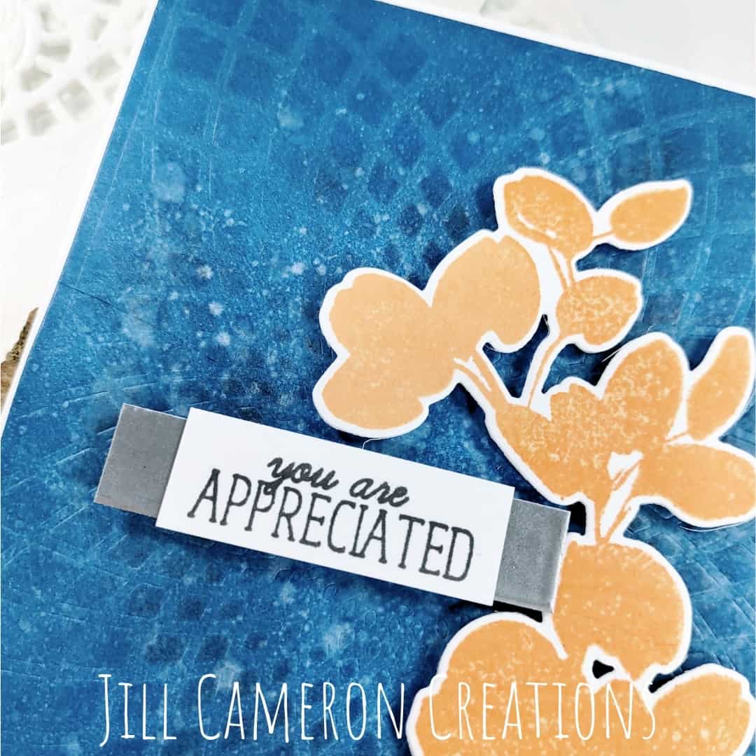
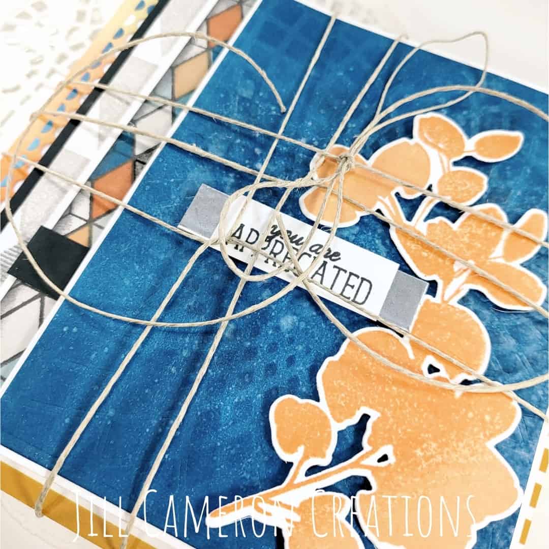
This is my favorite of the guys cards. I ink blended the entire panel in blue. And then I sprayed the media mat with water and smushed the panel into the water. I used my heat tool to dry the panel completely. And it’s gorgeous!
Then I ran the panel through my die cut machine with the Sunburst stencil to create that texture on the panel. I pulled it off but saw it didn’t stand out enough, so I placed the stencil back and added just a touch of darker ink.
I stamped the floral element in several orange colors and popped it up on the panel with some foam tape.
I didn’t have any silver mirror cardstock so I created my own with embossing powder. Then I center the sentiment on the silver strip.
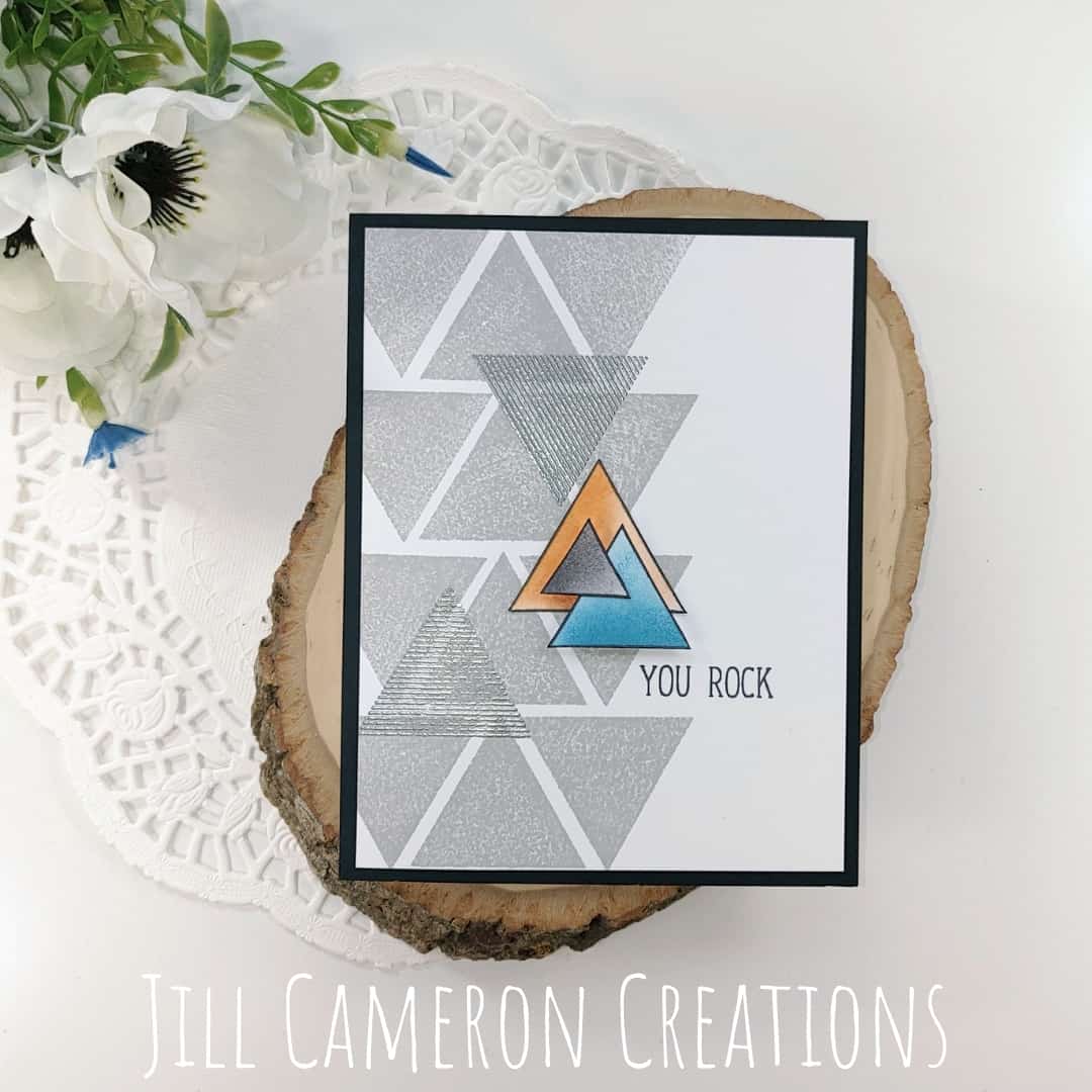
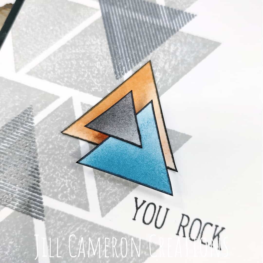
The final card is also geometric. I stamped the outline of three triangles and ink blended in our colors. I fussy cut out the triangles and used a black marker to color the edges of the paper.
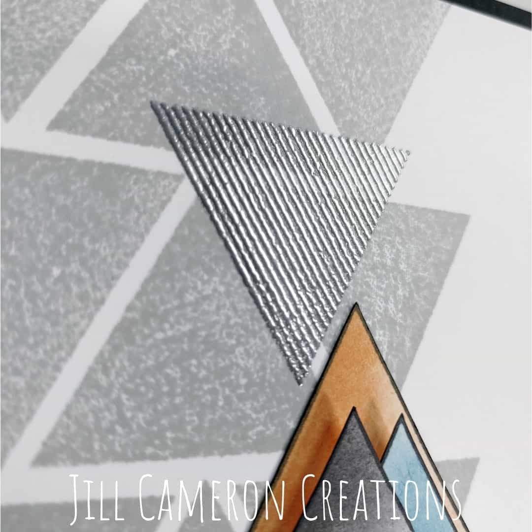
Then I stamped the solid triangle in a pattern on the left side of a white panel. Next, I stamp the lined triangle in embossing ink and used silver embossing powder to over lap a few of the triangles.
I stacked up the ink blended triangles and used some foam tape to separate the layers. Then I stamped the sentiment in dark grey ink on the card front. I matted the card front with black cardstock.
Finally, I created a flat pack for my packaging. I used some backer board I had cut down to 6″x 6″ and twine from my gift wrap stash. The twine is from Christmas gifts and my Mom’s crazy gift wrapping. I haven’t bought ribbon in years because I just save it from her wrapping. This was leftover from last year’s gifts.
Since, I like to use gift bags or need to mail card sets a lot I like the idea of a flat pack like this. The backer board keeps everything from bending and the twine creates a really awesome crisscross cage around the cards.
The envelopes are behind the cards and you can get a sneeky peek at all of the cards in the set.
Don’t forget to take a look at the Encouragement Cards for the Gals too!
This post contains affiliate links for your convenience. This means if you make a purchase after clicking a link, I will get a small commission with no additional cost to you as the consumer. I participate in the Amazon Services LLC Associates Program, an affiliate advertising program designed to provide a means for sites to earn advertising fees by advertising and linking to Amazon.com. For full disclosure policy click here.

I LOVE these! The colors, again, look amazing. They are unusual and not the ones people usually go for for masculine cards. I am glad you chose to go with completely unique color combinations. Great job.
Thank you for submitting your work to the AECP assignment gallery.