One Color Combination Two Ways
I read this so often in card making groups “I never know what colors to use!” So, today I’m showing you how one color combination can be used two ways for very different looks. This post is all about color. Of course, I have some techniques and tips thrown in there too. 😉
Read through the post first then watch the video that’s linked at the bottom.
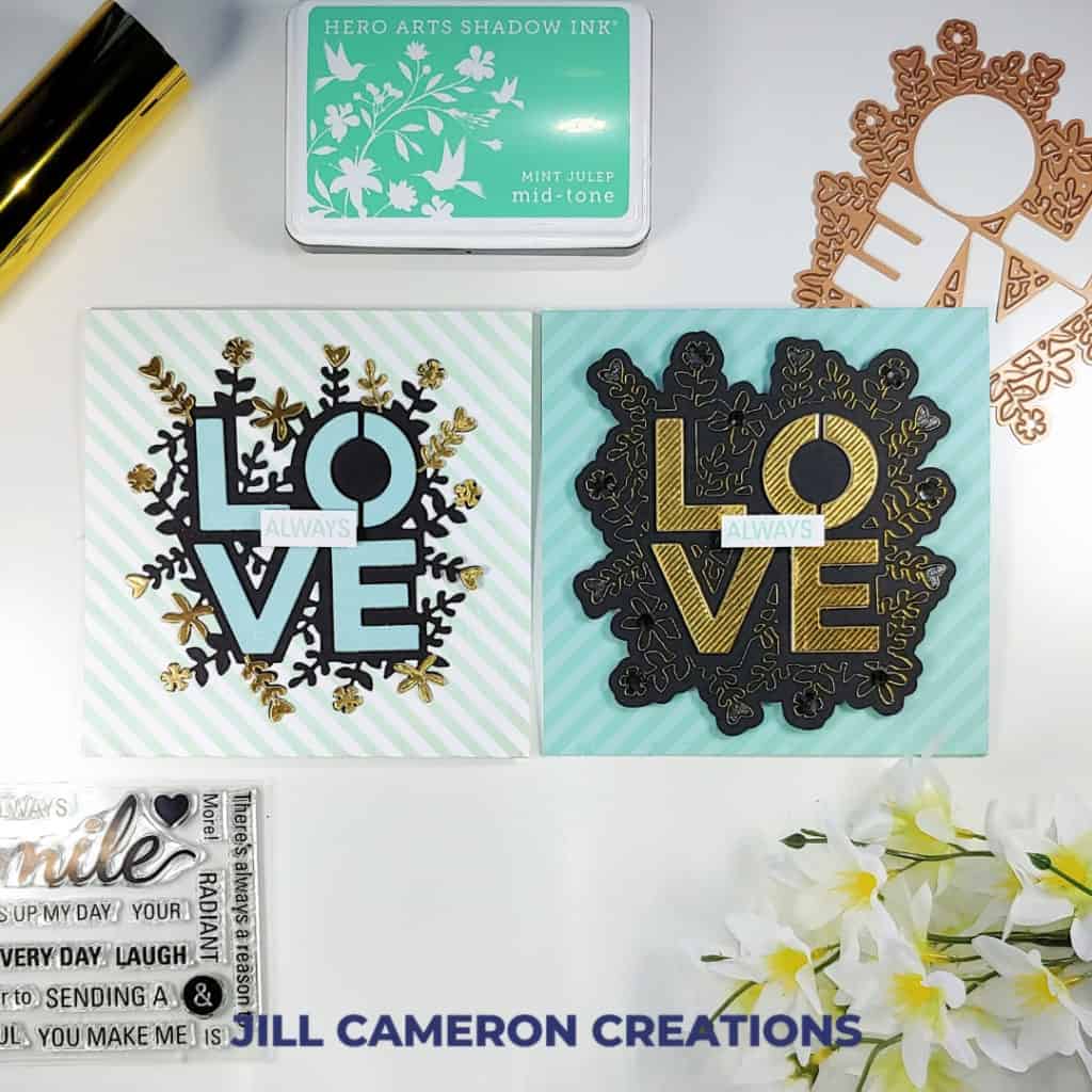
This is the color combination we are using today:

“I found I could say things with color and shapes that I couldn’t say any other way – things I had no words for.”
Georgia O’Keeffee
Color is an amazing thing. It can express emotions without saying a single word. Color can make or break your project too. (That’s one reason I like swatches so much! More on that below.)
One Color The First Way
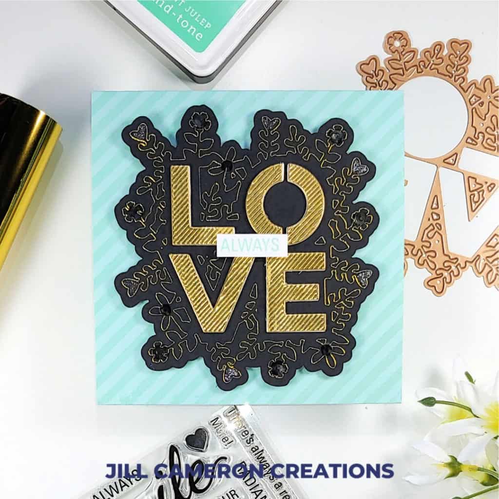
What’s the first thing you see on this card? The floral outline in gold on the black background? The gold letters of love?
It’s the delicate gold outline of the die surrounding the die-cut letters.
The first card I created using one color combination two ways was in a dramatic way. I wanted the feel of the card to be very elegant. To do that I used a lot of black and gold. I used the aqua color more as an accent than as a focal point.
This kind of dramatic effect is great for wedding cards, anniversary cards, and graduation cards to name a few.
The Same Colors another way
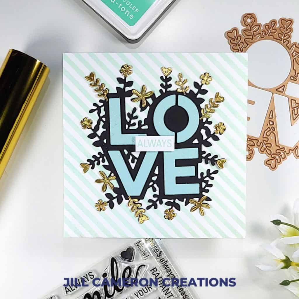
This card demonstrates the use of the same colors but in different proportions and with dramatically different results. This version of the card is more playful. There’s more white and a lot more aqua than on the previous card.
What’s the first thing you see in this version of the card? I see the beautiful sparkly letters. Then, I notice the gold accents.
Things mentioned in the video
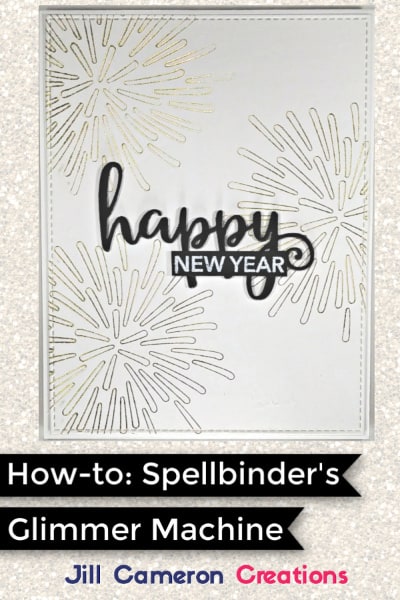
How-to Video: Spellbinders Glimmer Hot Foil System
Coin Pocket Pages for Swatch Book
Book Rings for Swatch Book
Ink Swatch Sheets
I created a bunch of Ink Swatch Sheets (including a blank one) and they are in my Welcome email series. Complete the form below to sign-up to receive my Newsletter. And don’t worry I won’t spam you.
Affiliate Disclosure Policy
This post contains affiliate links for your convenience. This means if you make a purchase after clicking a link, I will get a small commission with no additional cost to you as the consumer. Jill Cameron Creations/Jill Lipscomb participates in the Amazon Services LLC Associates Program, an affiliate advertising program designed to provide a means for sites to earn advertising fees by advertising and linking to Amazon.com. For full disclosure policy click here.

