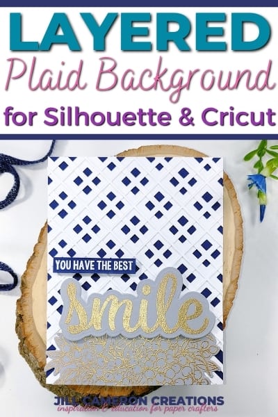
White Space in Card Creation
White space in any card is an important part of the overall design of the card. I know seeing a huge amount of white space on your project can be really scary. White space is your friend. Seriously! It allows the elements of your card to stand out. White space lets the design elements to create a feeling of free flowing design.
This particular card was inspired by the MFT Color Challenge and I missed posting it on their website. But I loved the colors so much I wanted to share the results with you. And it’s a perfect opportunity to share some tips about white space.
Affiliate Disclosure Policy
This post contains affiliate links for your convenience. This means if you make a purchase after clicking a link, I will get a small commission with no additional cost to you as the consumer. Jill Cameron Creations/Jill Lipscomb participates in the Amazon Services LLC Associates Program, an affiliate advertising program designed to provide a means for sites to earn advertising fees by advertising and linking to Amazon.com. For full disclosure policy click here.
White Space in Card Creation
First of all white space doesn’t necessarily mean white. It just means a blank space in reference to your card project. Some people are completely terrified of blank or white spaces. I might be a touch to unafraid of it. HA!
There’s something to be said for allowing the elements of your project breath and stand on their own. White space allows the eye to relax and comprehend the information or images on the page. When an image is too clutter the mind doesn’t understand it and cannot group the items it sees.
Another point of white space is to bring attention to the elements of the card. You don’t want everything on the card competing for attention. Consider white space a design element in your card and include it!
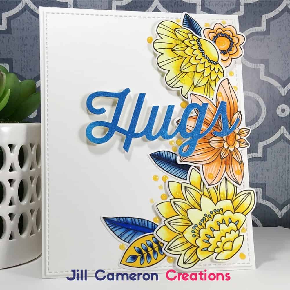
How I created this card
I colored the flowers using Copics. The flowers are from the MFT Stamps Fancy Flowers stamps set. I used the coordinating dies to cut out each image and arranged them along the right edge of a cut panel. Foam tape is behind the flowers and the leaves are glued flat down to the panel. I used the largest Stitched Rectangle by My Favorite Things Die-
The Hugs sentiment…I die cut that out three times. Next, I stacked up each die cut using tiny dabs of liquid adhesive between each layer. For the top layer of the sentiment, I ink blended some My Favorite Things Cornflower ink it to match the blues in my card. Then I die cut one more Hugs sentiment to adhere to the top of the stack.
To adhere the sentiment to the front of the card I had to add really thin foam tap under the ‘h’ and the ‘u’. This is it would sit evenly across the card. Also, let’s face it, dimension on a card is never a bad thing!
I added some Wink of Stella to the orange flowers and the sentiment for a ton of sparkle.
Check out this My Favorite Things Sketch Challenge card.
5 Comments
Comments are closed.