Papercrafters Unite Against Racism Hop
Hello! I’m so proud to be joining many other papercrafters today in several different hops to fight against racism and promote kindness. There are several different hops going on: the blog hop, the YouTube hop, and the Instagram hop. I’m participating in all three.
If you get lost along the way you can find all of the information on Justin Hovey’s blog. Next in the blog hop is Dana Warren.
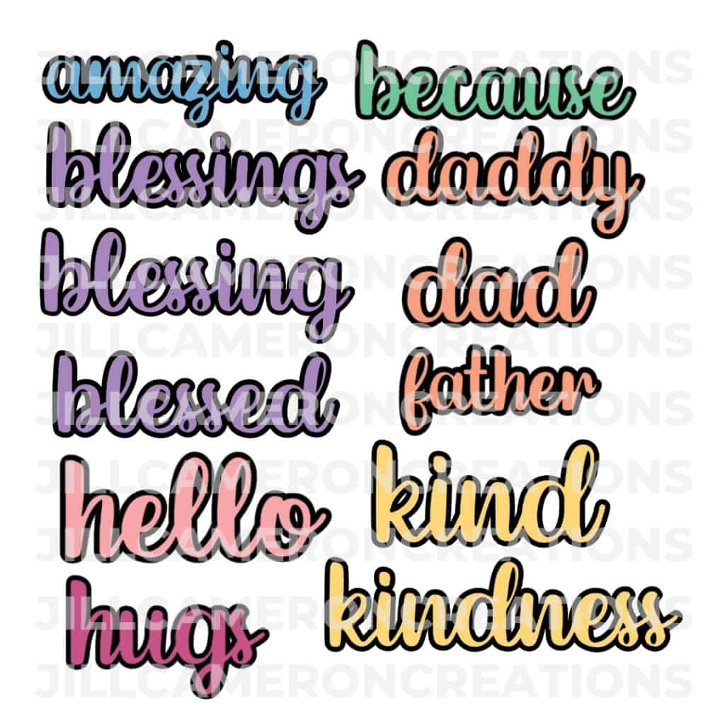
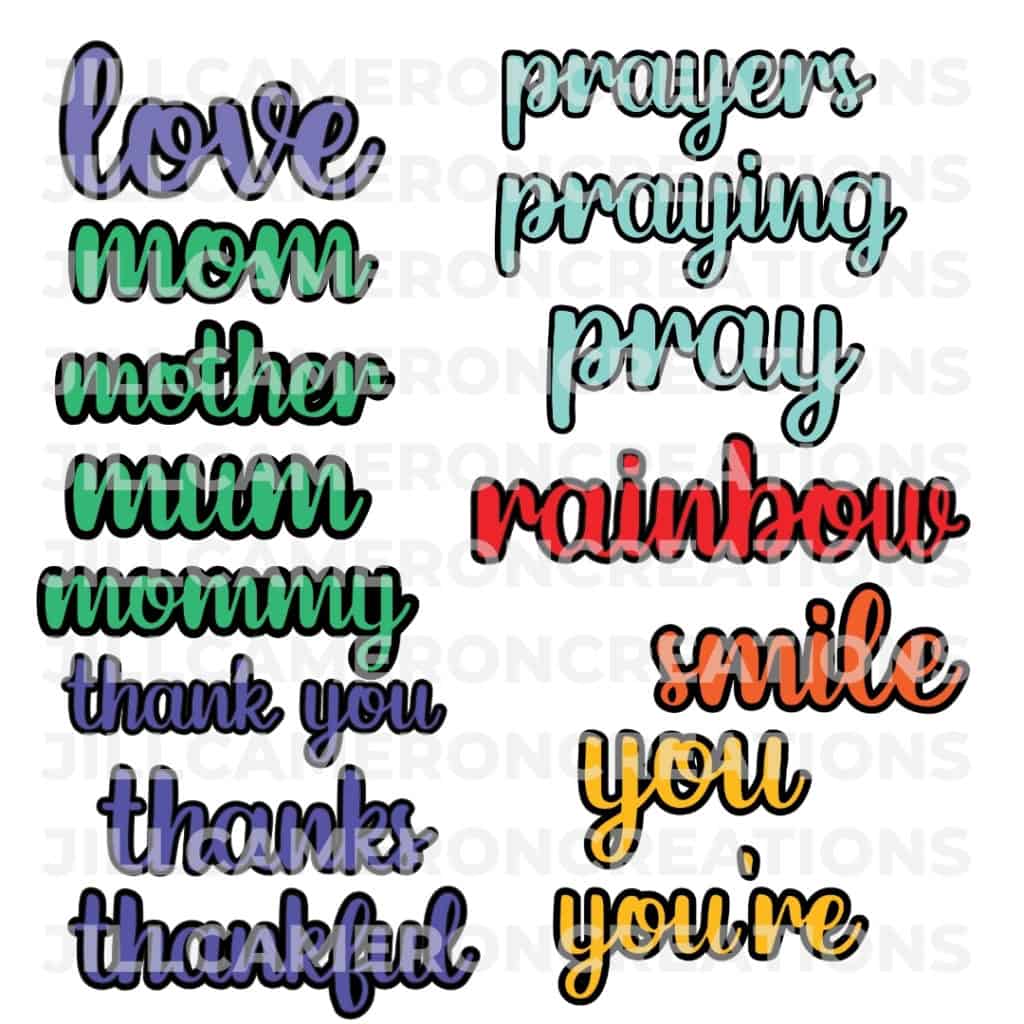
Click here to buy the Layered Scripty Sentiments
The Cards
I made five cards for this hop and each one centered around love and unity. Each cards has a unique sentiment and a simple design. I wanted to showcase messages of unity and togetherness. The things that bring us together and make us stronger in our communities and our friendships.
You could make all of these cards in a single sitting. I made a bunch of backgrounds using watercolors and alcohol inks. Let’s take a look at the watercolor cards first.
All of the sentiments (except the together sentiment) are included in the bundle above. I cut the shadow from black cardstock and the sentiment from white cardstock twice. I used a Silhouette Cameo 3. I highly recommend to set the overcut feature of the Silhouette Studio software and cut twice. This makes sure every letter is cut perfectly. Also, if you’re using 110lb cardstock for your letters, cut three times.
Watercolor backgrounds
I have several watercolor pallets and I haven’t used my Kuretake Gansai Tambi Watercolor set for a long while so I thought I’d pull it out to create some watercolor backgrounds. I use inexpensive watercolor paper and inexpensive brushes.
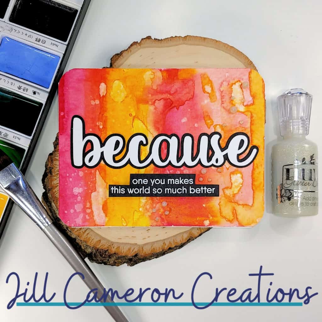
Watercolor doesn’t have to scary. Play with it. Dry the paper and add more to it. This panel has an alcohol ink quality to it. It’s messy and fun. I dried this panel. I added more water in puddles and dabbed it with paper towels. Also, I dipped a paper towel in paint and tapped it in different areas of the panel. I love how this turned out.
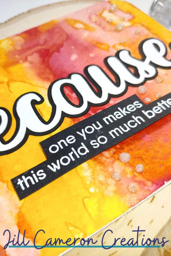
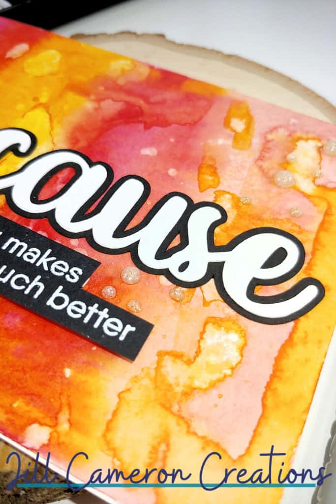
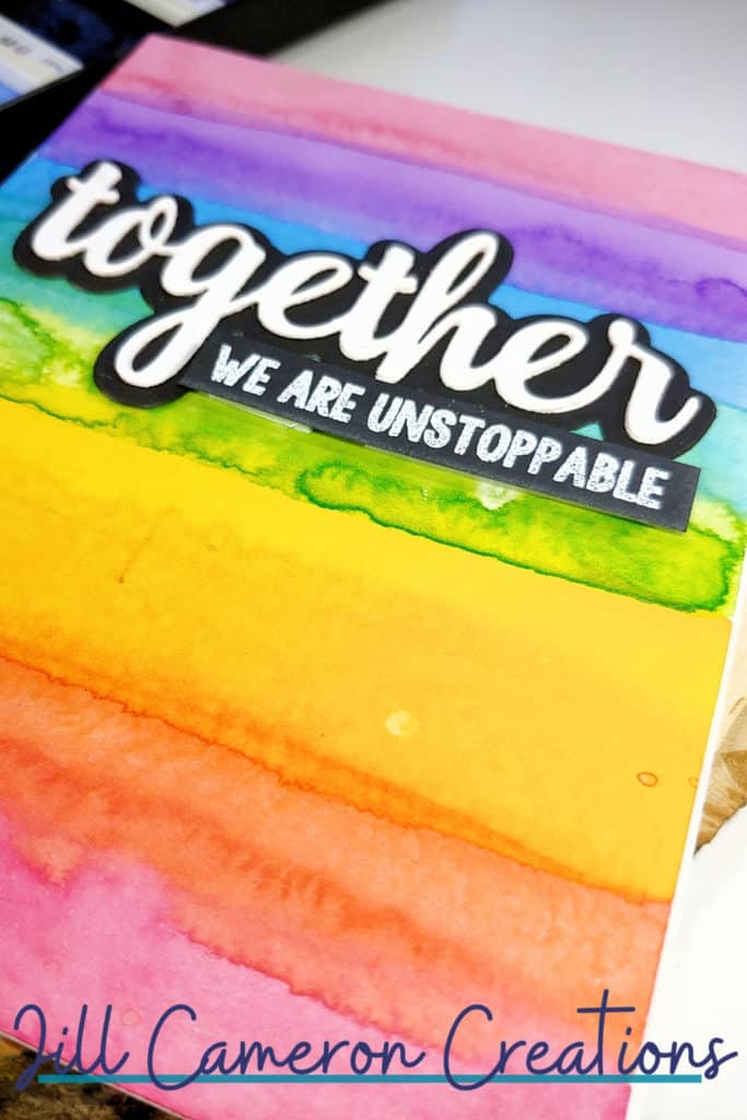
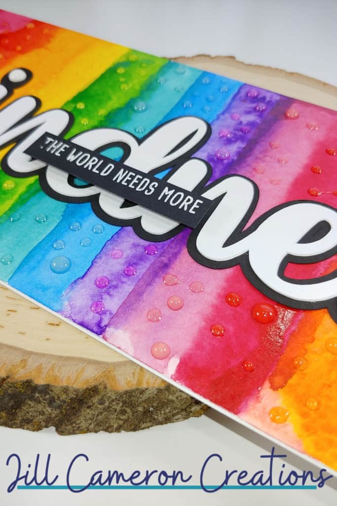
For the next two panels, I used a flat 1/2″ brush and did stripes across the panel. Make sure to change your water between color groups so the colors don’t get muddy. I let each stripe dry a little bit but also it had enough moisture to blend some into the next color.
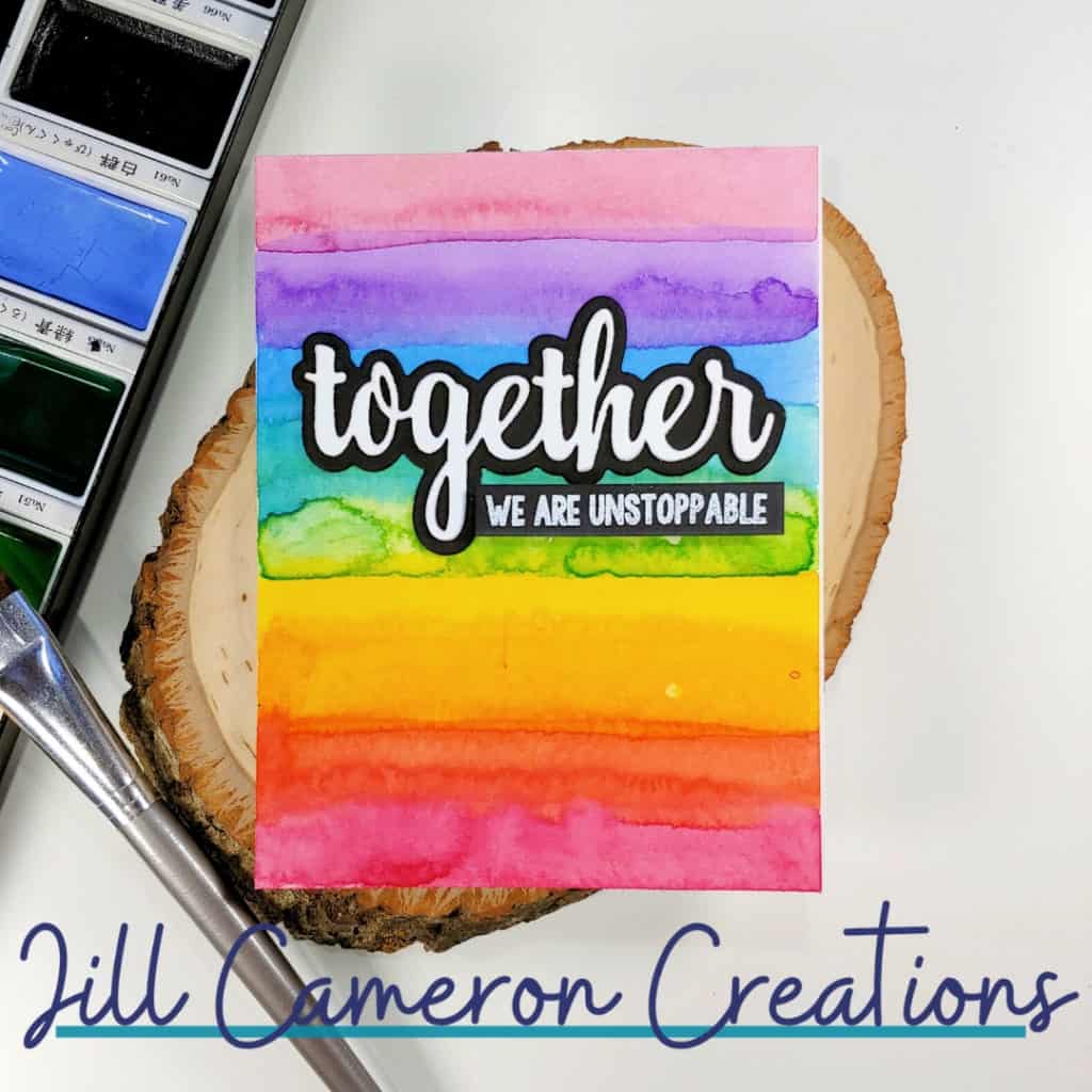
The colors on the together card are softer. I added more water to the colors but the colors are still vibrant which is one thing I love about these watercolors.

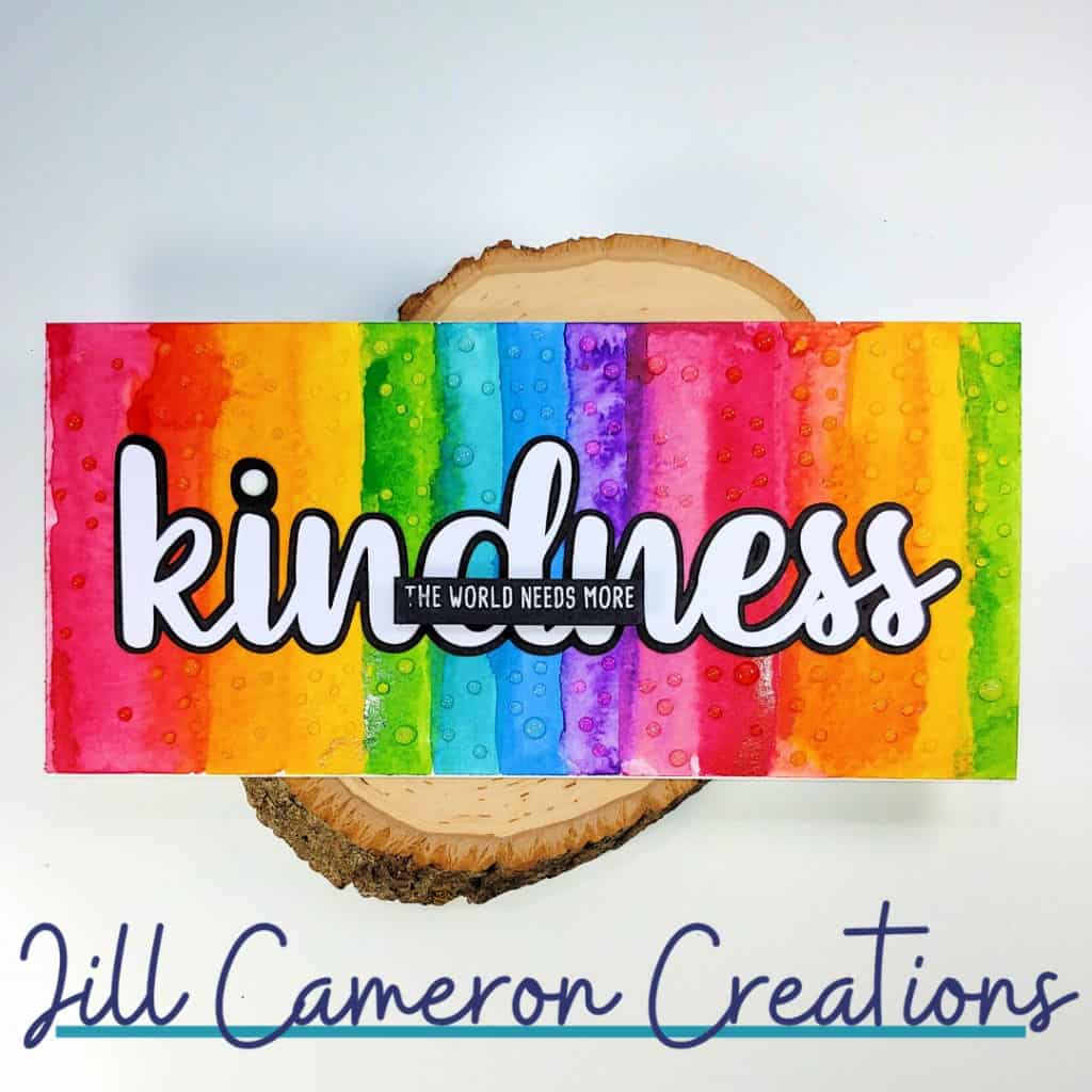
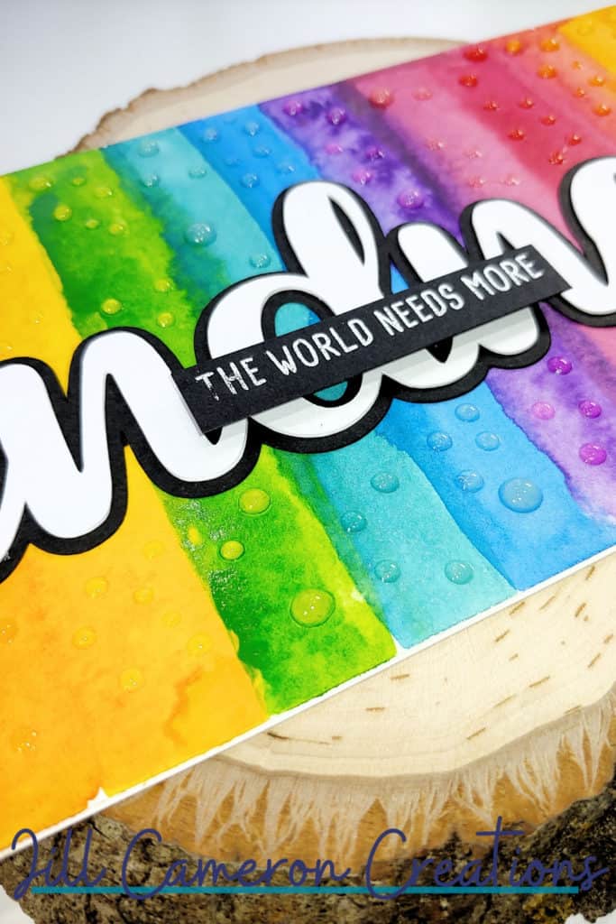
Check out how bold the colors are on this watercolor panel. I used more paint and kept the colors drier between each stripe.
Alcohol ink backgrounds
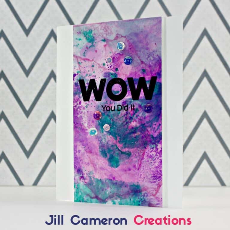
Alcohol inks are always fun to play with. To get these two backgrounds in full effect be sure to watch the video. One panel started with blending solution and the other is on dry Yupo paper. Both panels are beautiful and unique in their own way.
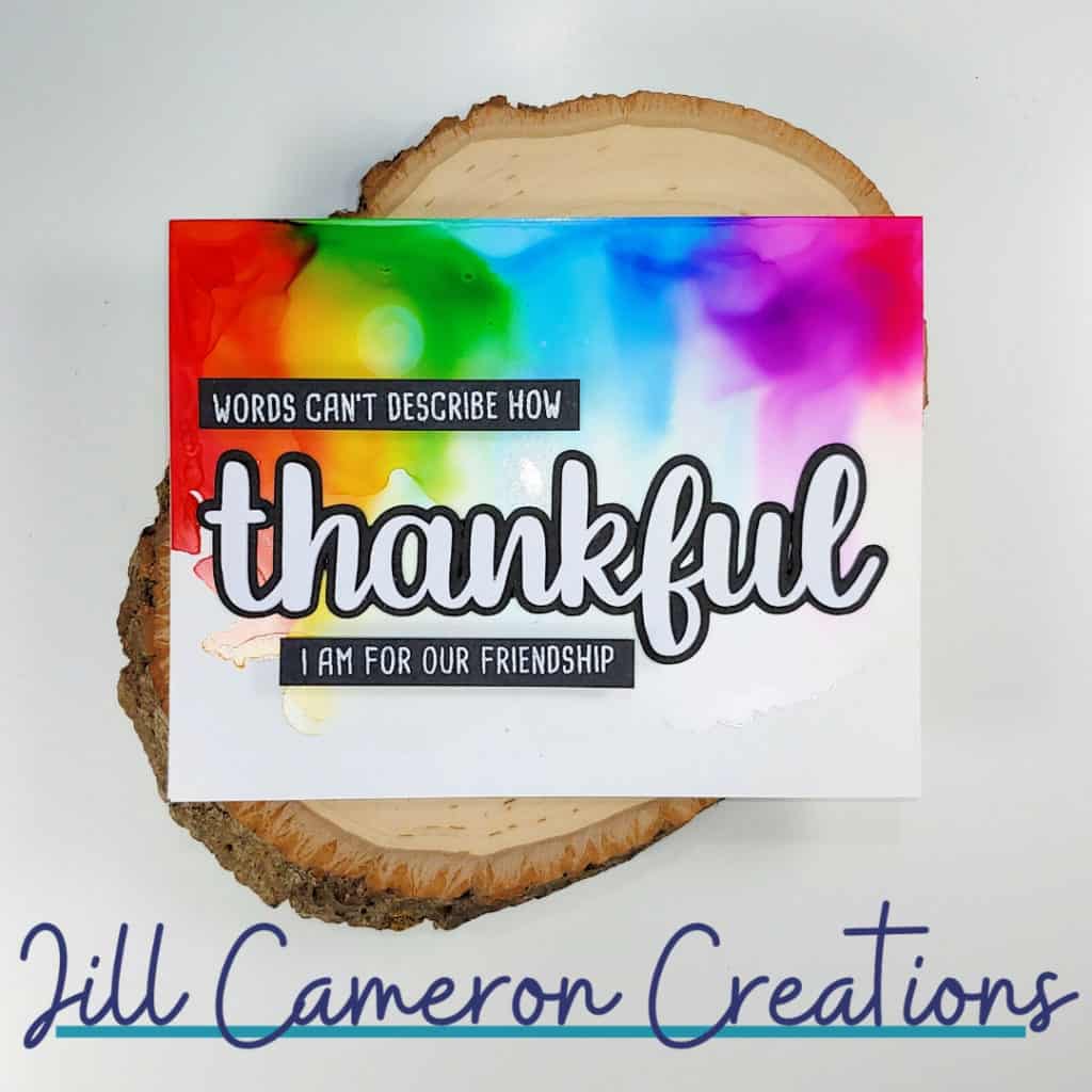
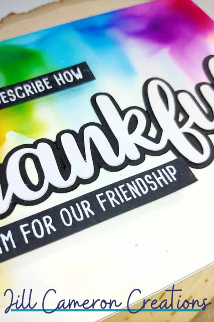
This is the panel that started dry and then I added blending solution and tipped the panel up to allow the inks to travel.
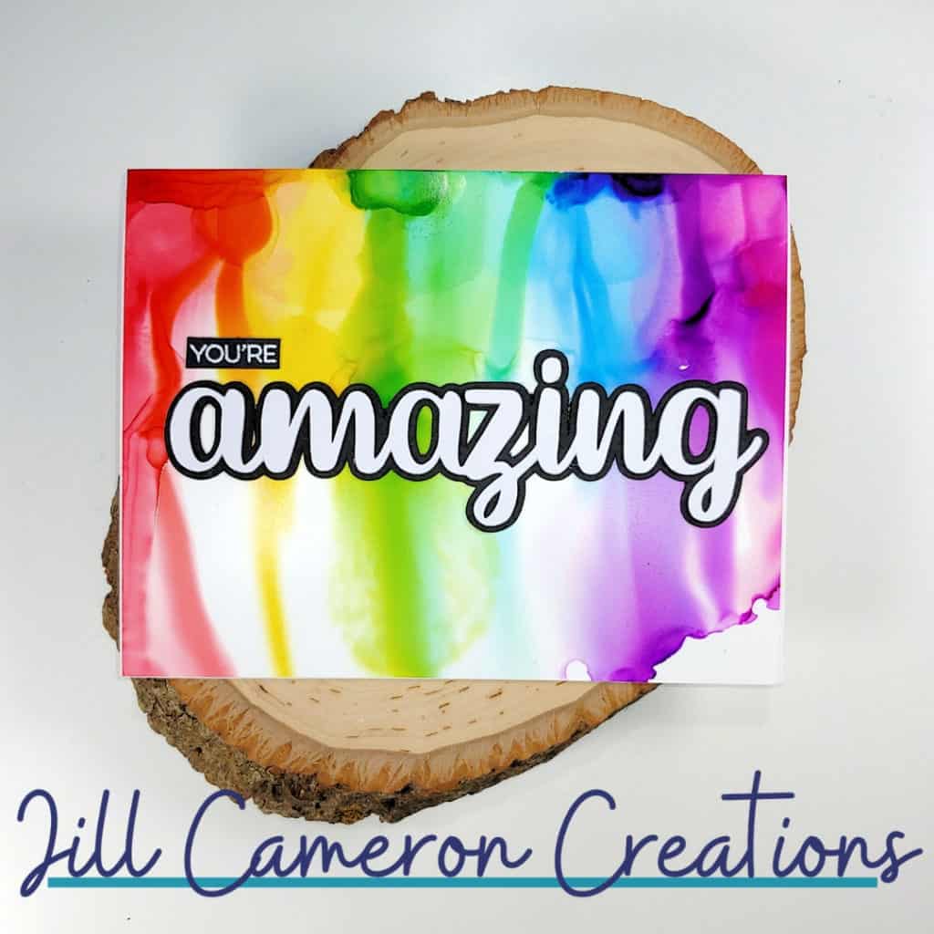
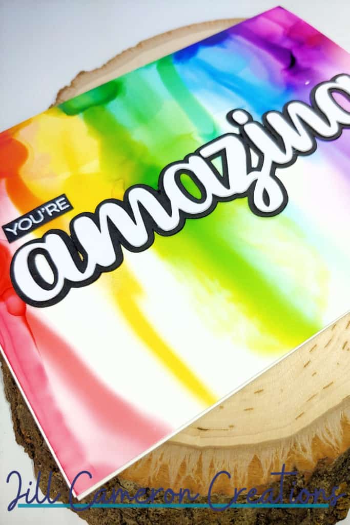
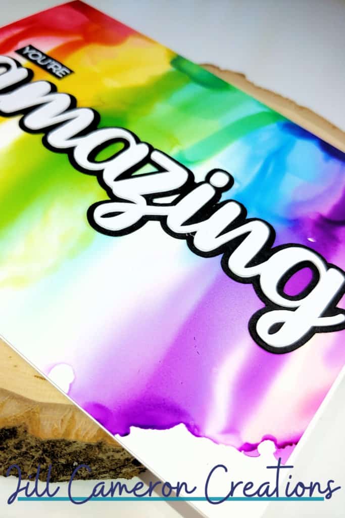
I hope you enjoy these cards and use those sentiments to share some love and kindness with others around you.
Affiliate Disclosure Policy
This post contains affiliate links for your convenience. This means if you make a purchase after clicking a link, I will get a small commission with no additional cost to you as the consumer. Jill Cameron Creations/Jill Lipscomb participates in the Amazon Services LLC Associates Program, an affiliate advertising program designed to provide a means for sites to earn advertising fees by advertising and linking to Amazon.com. For full disclosure policy click here.

See more Silhouette Projects…
Layered Dad Slimline Card
Silhouette Cut Settings – Overcut
First Cut with Silhouette Cameo 3
all beautiful, but my fave is the amazing card!
Thank you! That one was so easy to make too!
These cards are colourful beauties ! My favourite background is the one of the “because-card”.
Thank you for sharing your talent in this great and important bloghop !
Thank you! That background was the oops one and turned out to be my favorite too!
Really beautiful! Hopping along!
Thank you!
The rainbow backdrops in your cards as so beautiful!
Thank you! I love rainbows on anything.
I love all the cards! Each one is stunning and beautiful!
Thank you Erica!